Things are about to look a little different around here, and there’s a lot to love.
We arrived on the Springfield scene celebrating our launch with a Mother’s Day bash in 2011. We brewed four beers. The message to the town was clear: we had arrived, and we’re here to get down.
A decade later and the party hasn’t stopped. We make more beers now, distribute further from home than ever, and the guest list keeps on growing, but a Mother’s love has remained at the center of it all. Our new identity is here to spread the word louder than ever.
Refreshing Our Heart
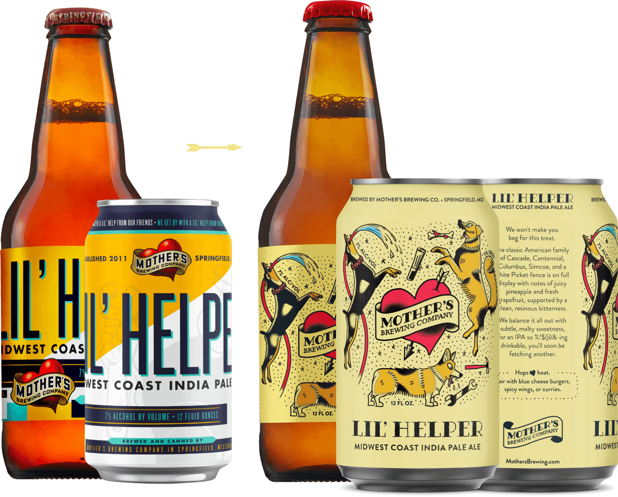
Our new look fully embraces our tattoo-inspired logo.
By centralizing the logo in artwork inspired by a tattoo sleeve, our new labels uniquely integrate the central brand identity with unique beer artwork.
This look maximizes brand cohesion, while allowing for strong product differentiation & personality across our line.
- New, neutral background hue anchors all packaging while allowing colors to pop.
- Beer names & styles are centrally located and easily found on three faces of every can for greater visibility.
- Cheeky descriptions & pairing notes reinforce our voice.
The Art of the Heart
Our entire heart & banner are now rendered in more distinctive American Classic tattoo style.
Custom typography evokes tattoo art on its own and can be isolated when necessary while maintaining brand recognition.
Flat shading treatment allows logo to be reproduced in one, two, or three colors.
FIND THE LOVE
These days, it’s easy to get a little cynical, so we’ve a hidden heart somewhere on every label as a subtle, ever-present reminder to our drinkers to always find the love.
Can you spot ‘em?
Brewed with love, in Springfield since 2011.